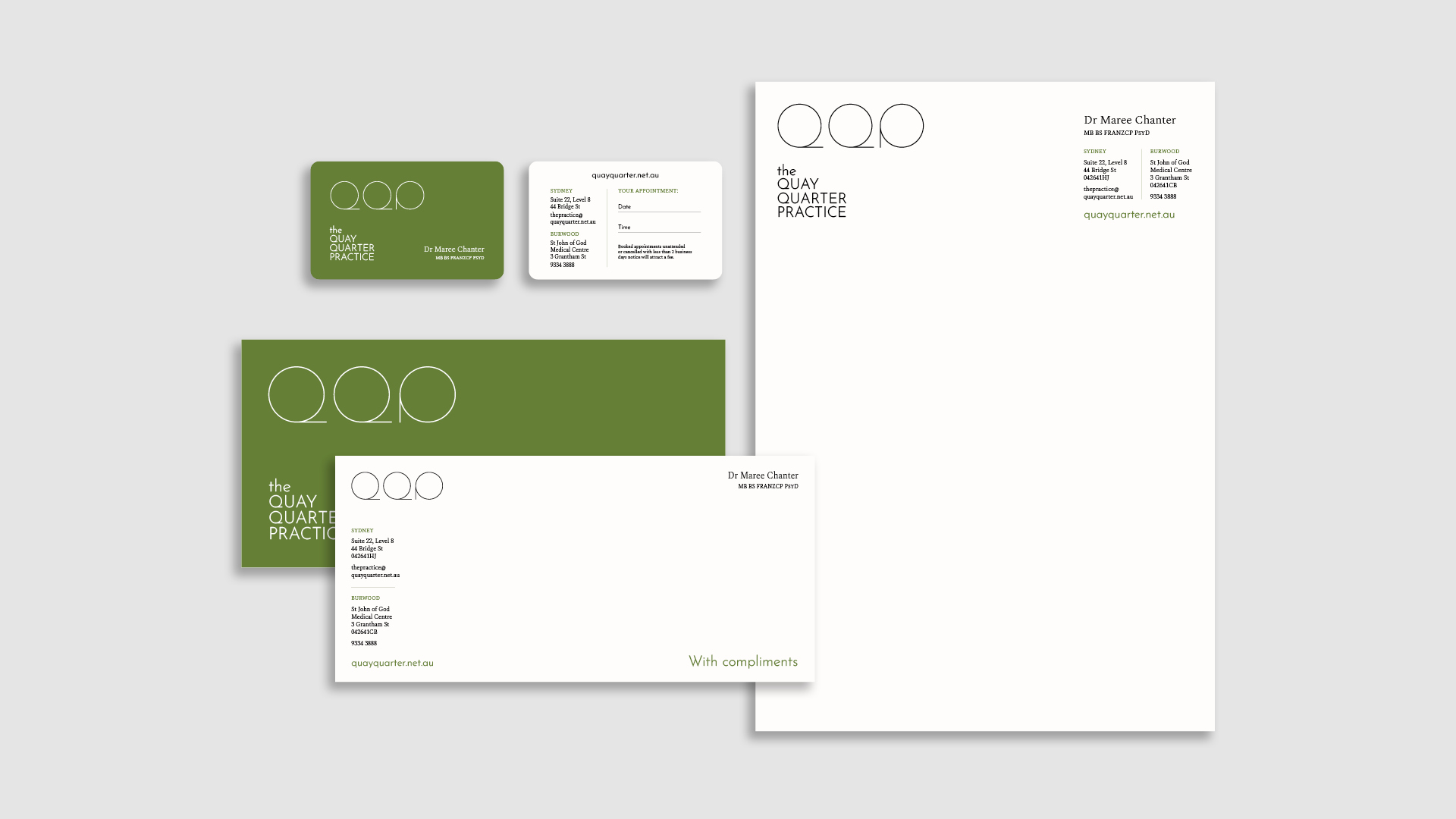
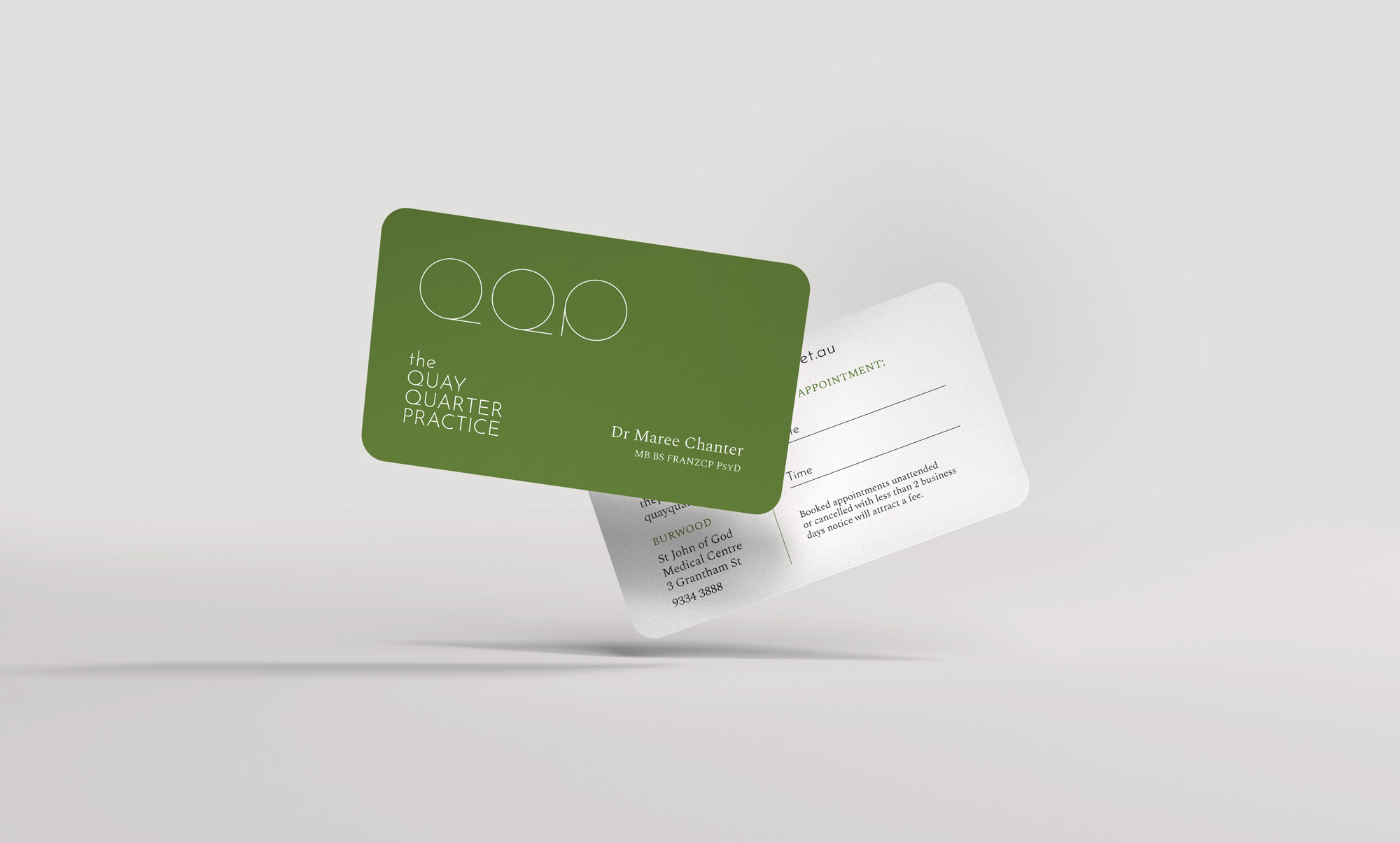
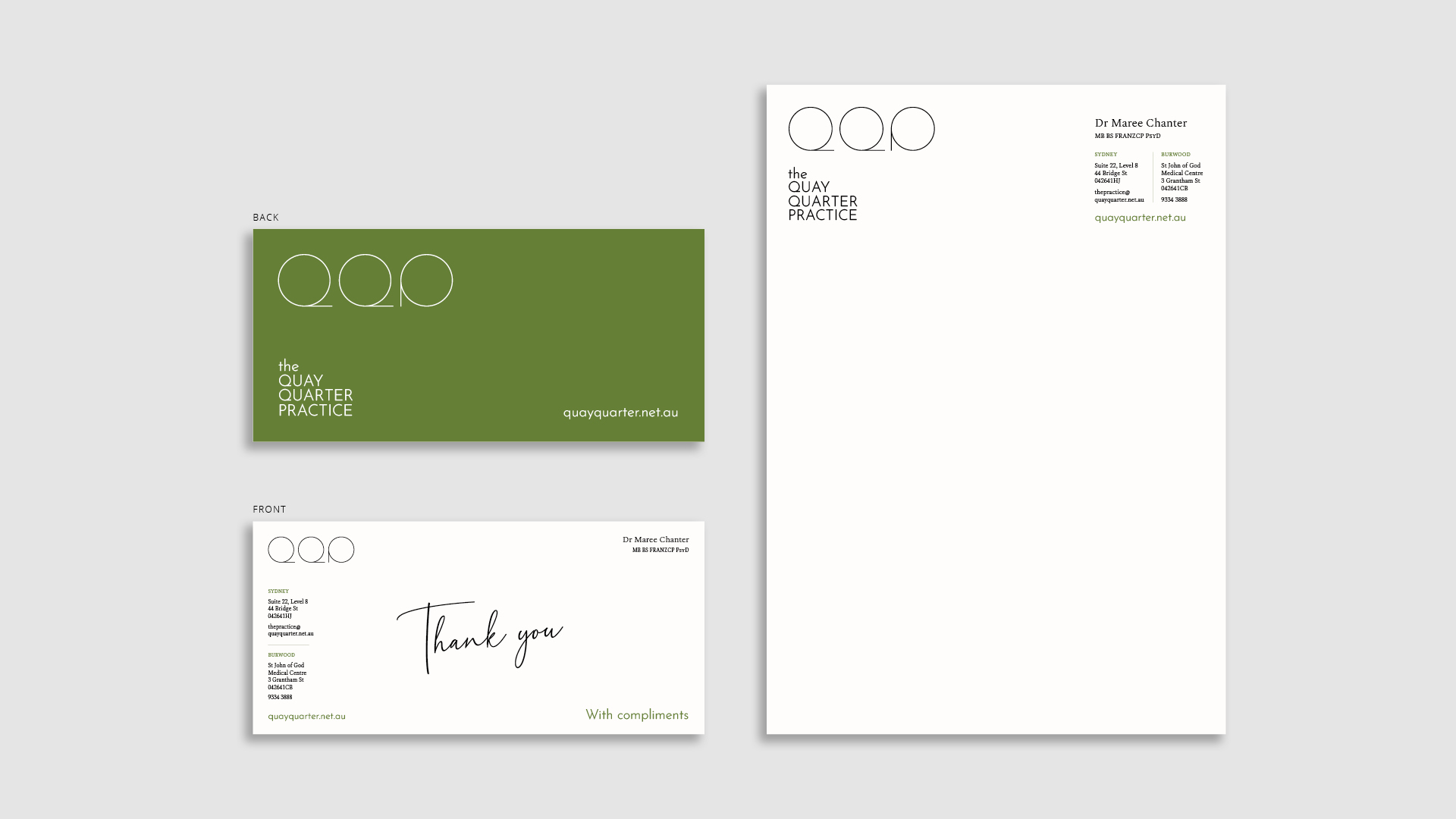
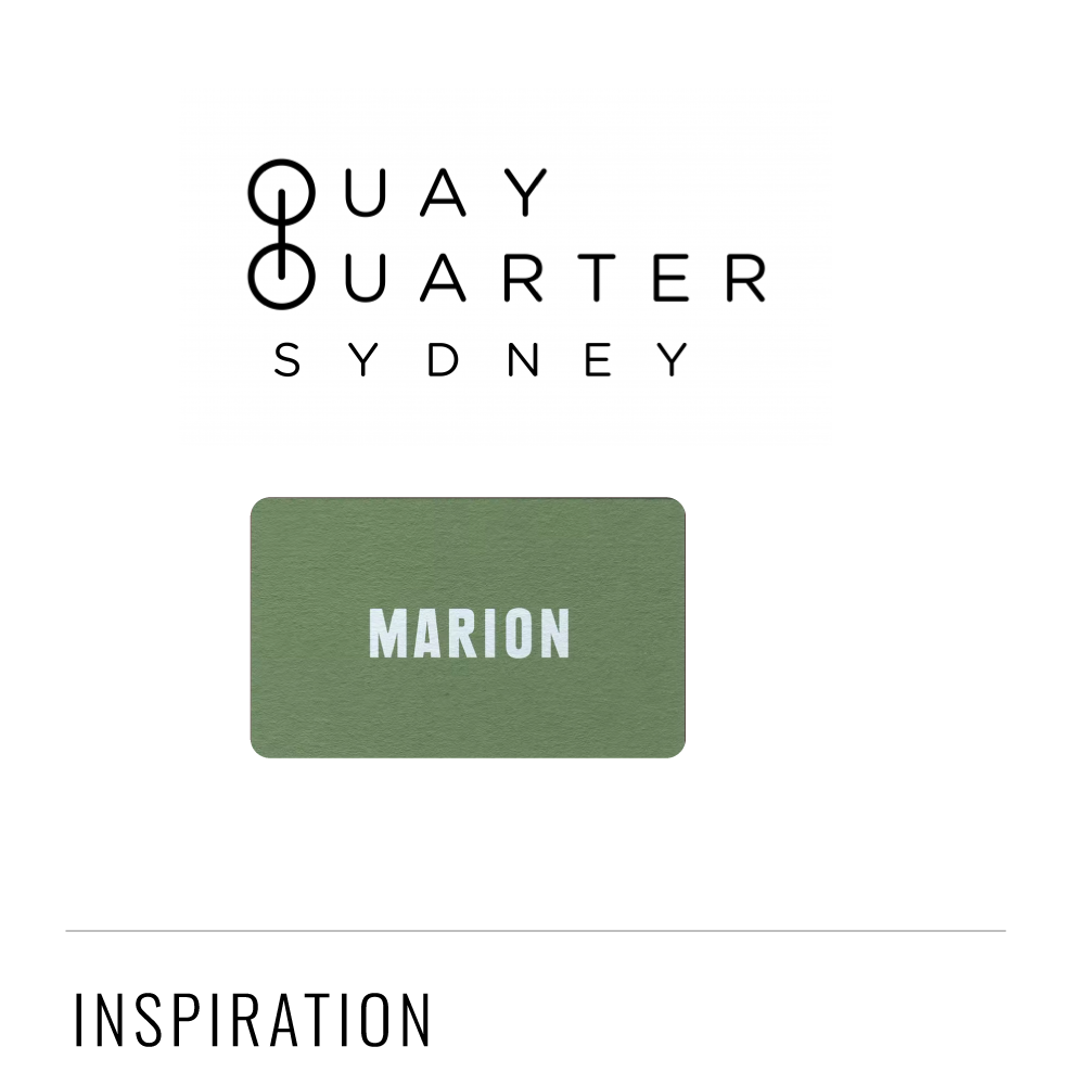
The brief was to create a simple, typography-based logo, using the Quay Quarter precinct logo as inspiration. This was then to be rolled out across business cards, letterhead and with compliments slips.
DESIGN – BRANDING
As usual when I first start designing a logo, I did a whole lot of terrible sketches, and followed up some of the better ones on screen. I wanted the logo to be clean and somewhat geometric, but also a little decorative and soft. Some of my initial thinking is on the right.
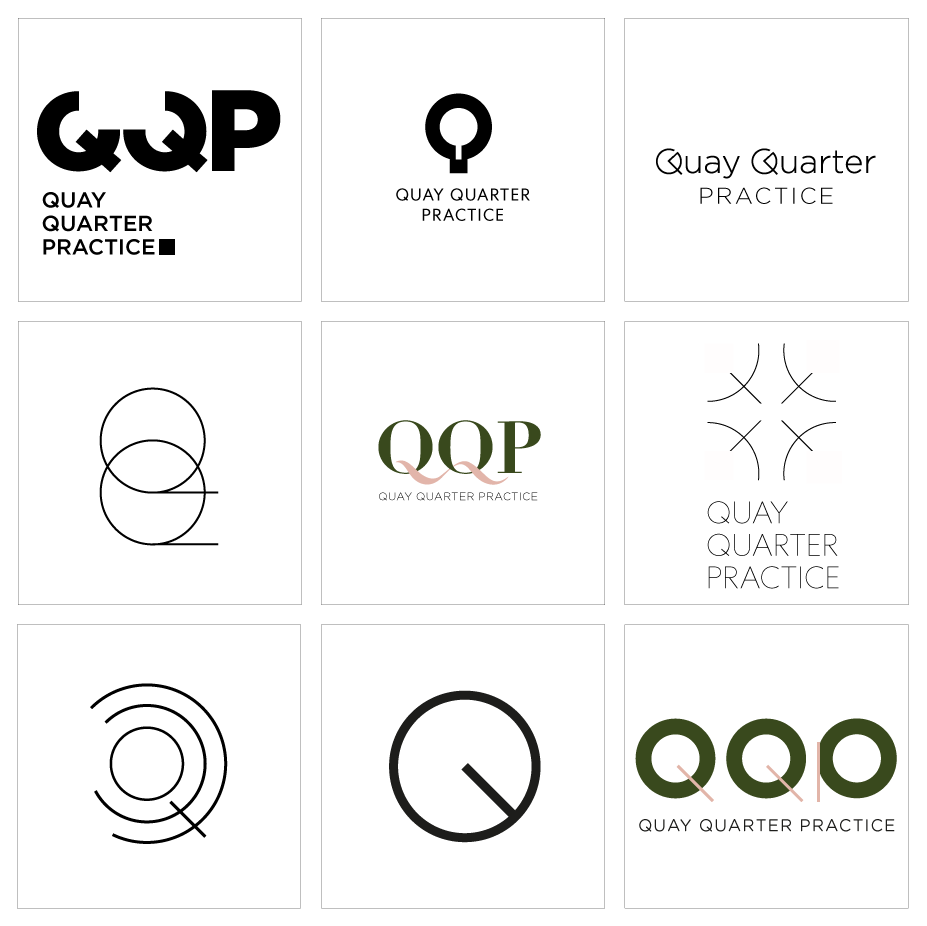
Selected logo options presented to client
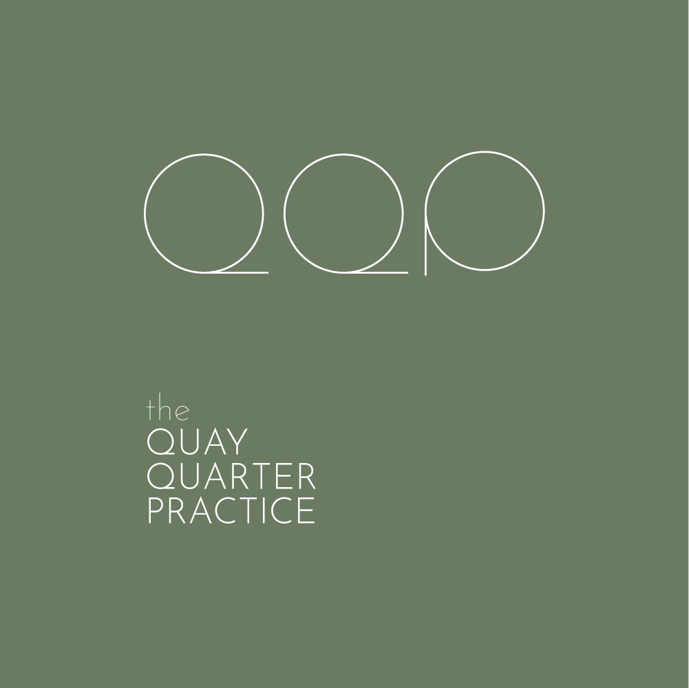


We explored lots of different greens and colour options
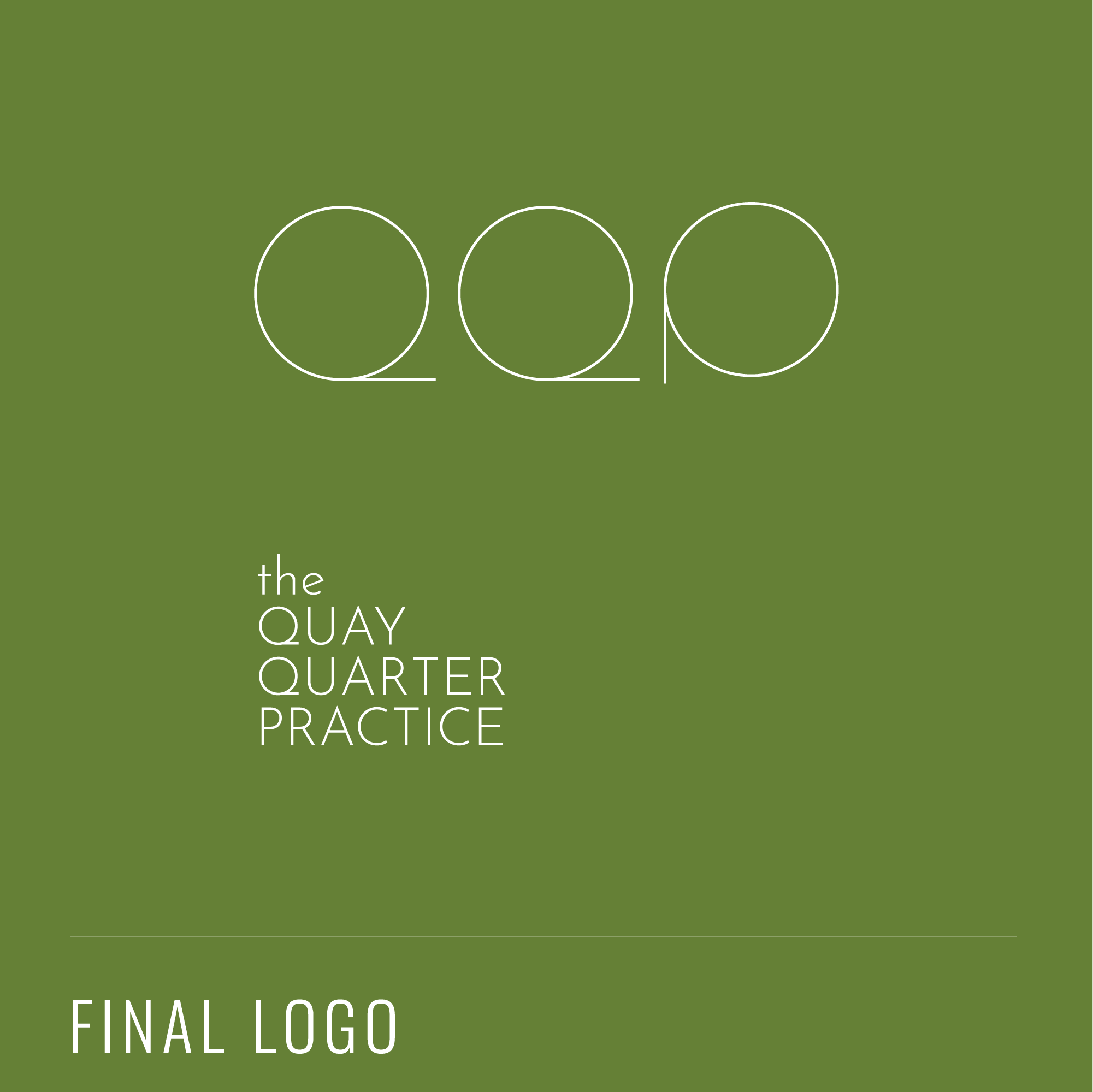
and finally settled on this logo
This was then rolled out across business cards, letterhead and 'with compliments' slips to complete the stationery set.
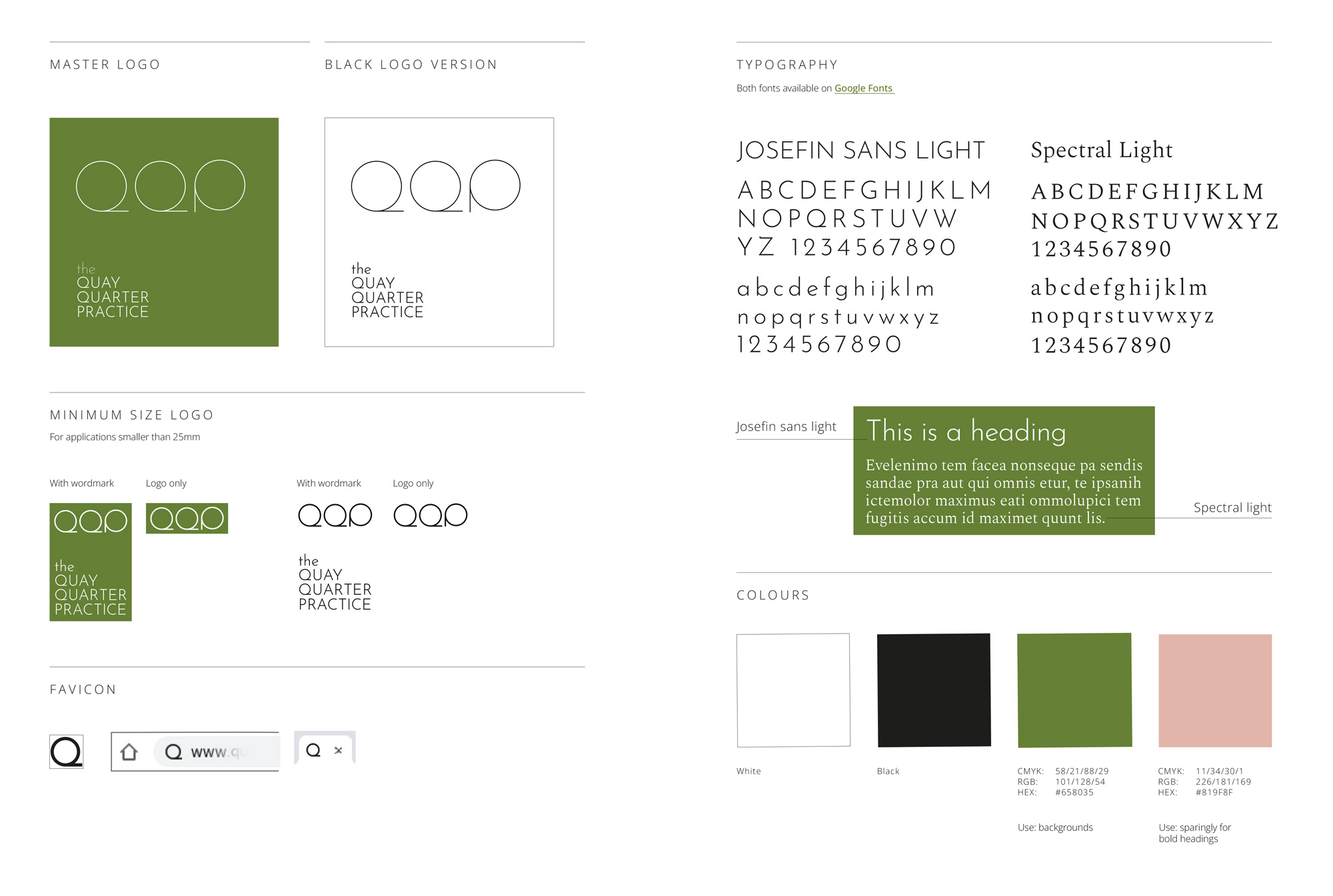
I also created a short brand guidelines to enable the branding to look consistent across any future assets.
