Cymax, a company that provides business IT solutions to hundreds of clients across a broad range of industries, wanted to refresh their brand and logo. They thought it had become dated and didn't reflect their brand, which is more concerned with current and upcoming IT solutions than ones set in the past.
DESIGN – BRANDING

I started out with a more modern take on the original logo, as it was briefed in as a redesign not a whole new design. I kept the blue as it is a colour associated with technology and innovation, but lightened it as I thought the original blue/grey combination was a bit heavy I added the chartreuse as a counter colour as it added contrast and energy to the design.
From there I moved further away from the original logo.
The second option (top right) includes the “swoosh” of the original logo, adjusted so that it comes full circle, representing the full service feature of Cymax. The large C is almost circular too, creating balance with the ‘atom’ in the centre. In this version I again chose a rounded typeface, to make the logo seem more friendly and approachable
The third option still features some elements of the original logo (atom, swoosh line), although this logo is also a subtle play on the “power” button. The typeface has changed in this wordmark: this is the regular form of the Coda font, a bold, angular and techy typeface that offers a counter to the roundedness of the logo. I moved away from the chartreuse colour in this design as the reddish colour related better to the “power” idea that I was working with.
The last option (bottom right) This option draws on the familiarity of the square bracket used in code. I have softened this hard shape by rounding the corners and through the use of gradients, which are sectioned into three distinct parts that fit together to create the whole. The purple-blue colour combination lends sophistication, and purple is often used to convey peace of mind and harmony in design. The wordmark repeats the mixture of sharp edges and rounded corners of the logo. The C has been modified slightly so that it replicates the larger C of the logo, with the sharp/rounded corner combination.

None of the logo ideas were quite right for what they wanted, so I gave Cymax some more options, including many that disregarded the original logo. Some are colour variations from the original logo options as well.

These weren’t right either so it was decided that I needed to be rebriefed on what they wanted. There was nothing necessarily bad in what I had sent them, but nothing was fitting the bill so I sent the team at Cymax a questionnaire to try to get at what they wanted.
Infinity symbols and hands came back as suggested motifs, and I was to stick to the bluish colourways as they agreed with my rationale for using blues.
Back to the drawing board!

They liked one of the fonts from the previous work (Gotham) so these versions use various styles of that font.
The first option is a reverberating infinity symbol, chosen to represent all the areas that technology touches our lives (and thus what Cymax can help customers with).
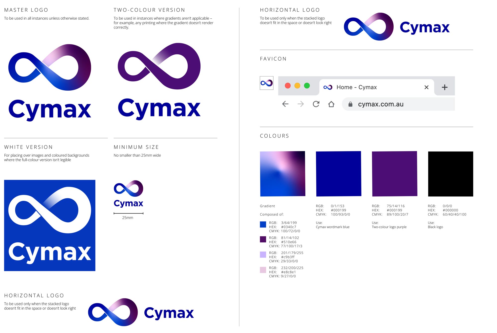
The second option is an infinity in gradient blues and purples. The infinity is made from two C’s, one facing the correct way and a bolder, larger, mirrored C for the right side. These were then joined together, leaving a little slice of white under the overlap to indicate depth.
The third option represents two things: Cymax having their finger on the pulse, and a mouse click. The hand has been drawn in simple lines, while the curve between the top of the index finger and the thumb forms a C-shape. The ends of the lines are rounded, creating a soft, friendly look.
The final option expands on the ideas in the previous option and features a hand making a C-shape which was created by repeating C’s from the wordmark.
Option 2 was chosen as is.

I provided Cymax with a basic branding guide as well as mockups
of how the logo could look on a shirt.