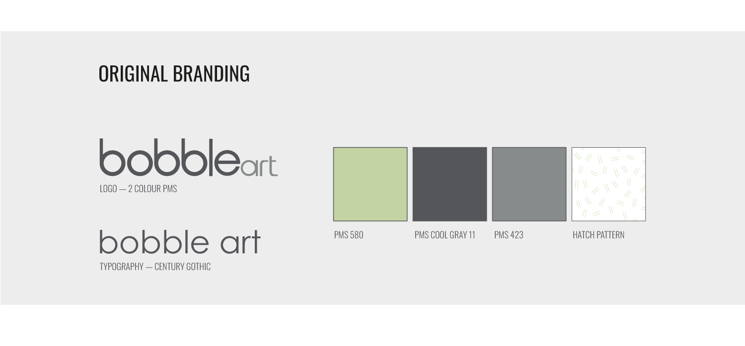
When Australian Geographic first bought bobble art, we inherited a logo, a few colours and a font. With this limited branding, and our imminent roll-out of retail stores, I had to develop a much larger brand presence that was bright, colourful and worked within the design of the new stores.
BRANDING
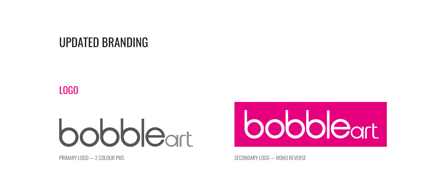
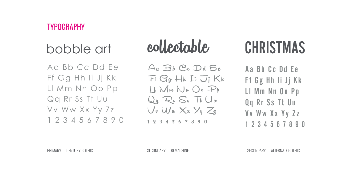
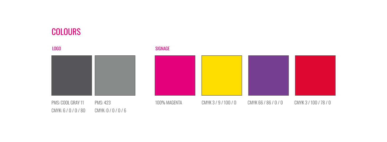
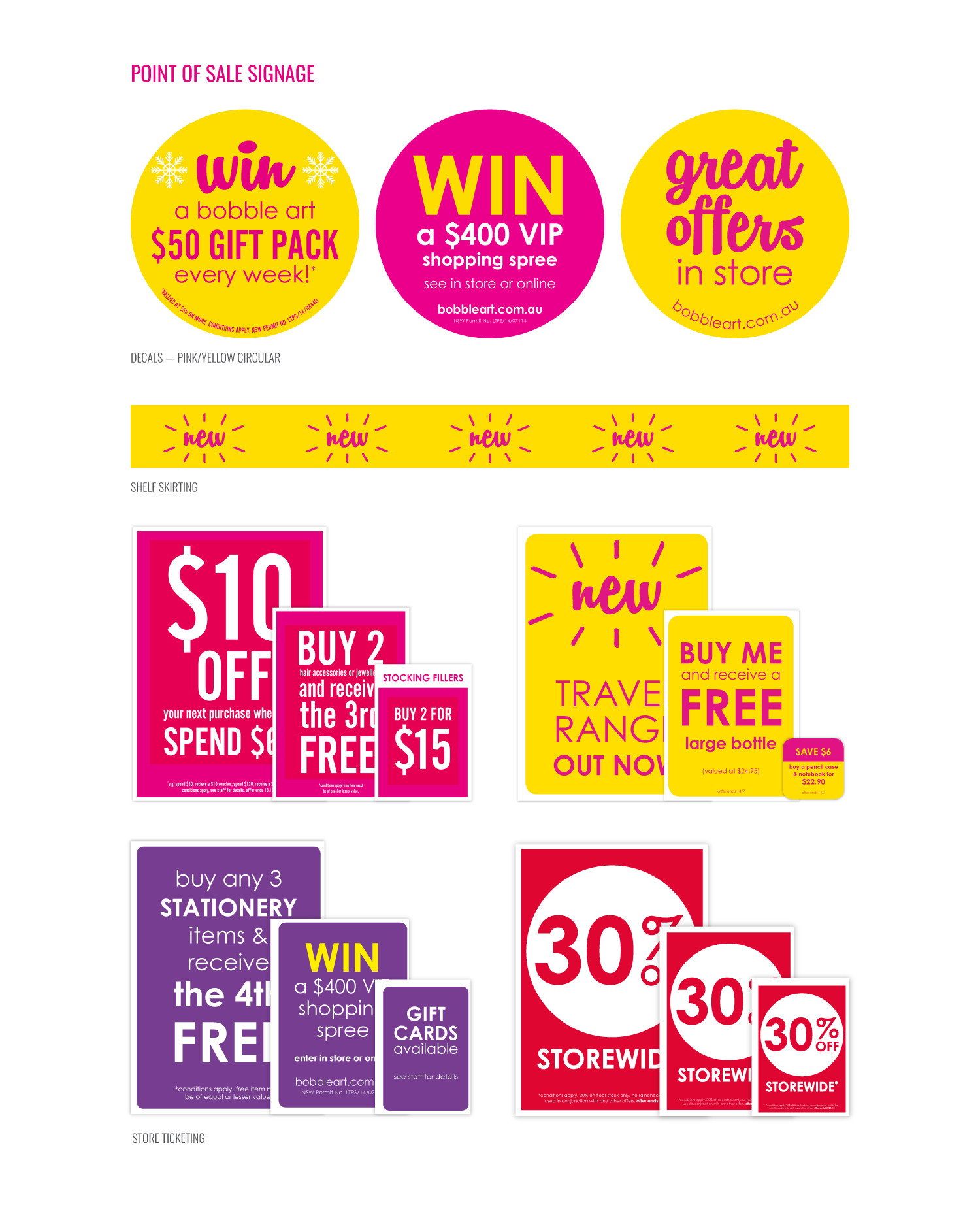
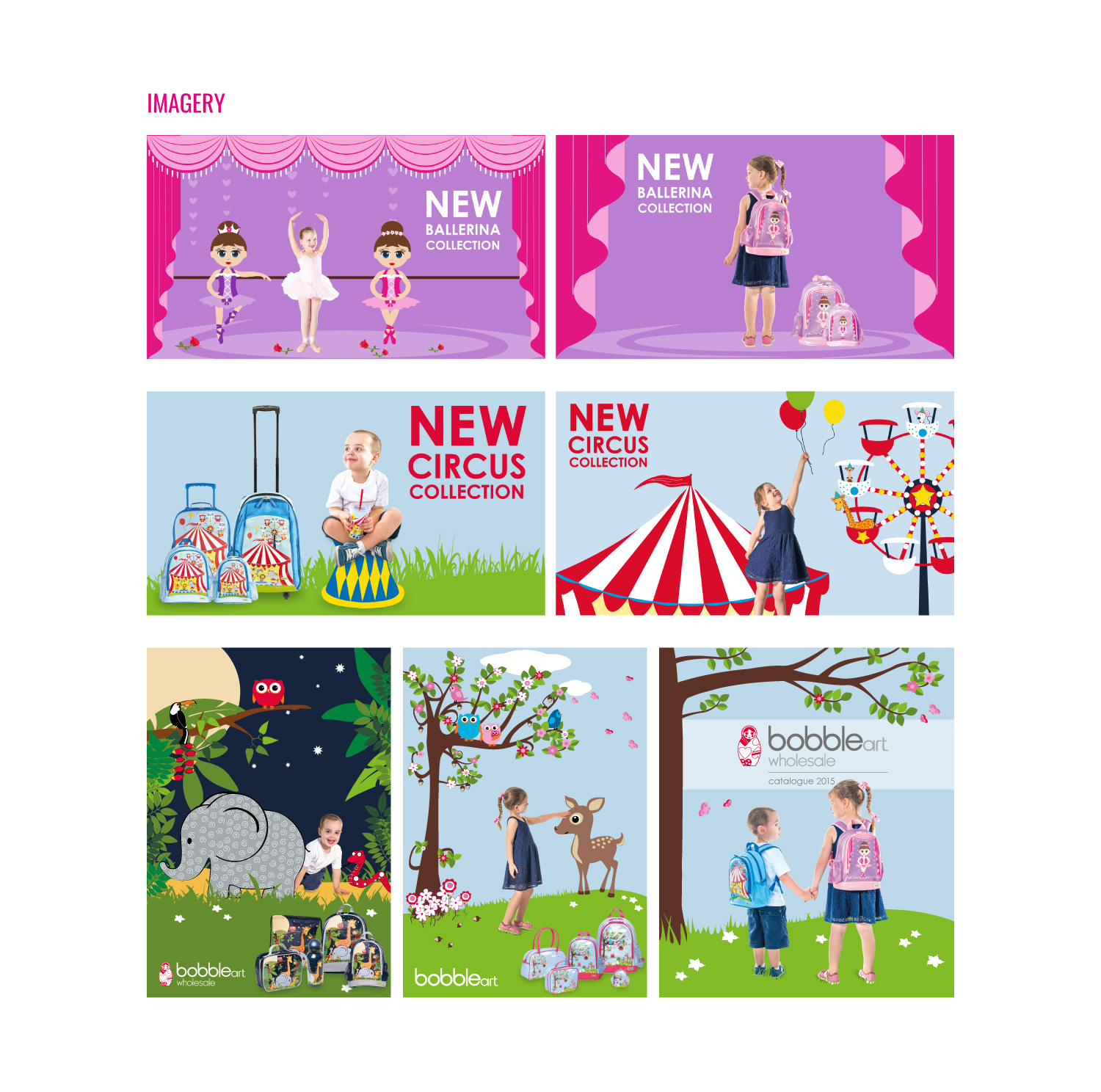
In order to be used in retail stores, the bobble art brand had to be developed – there was just no scope in the current branding for eye-catching signage and interesting graphics. Therefore, I added new fonts, colours and a look and feel that could used for the initial store roll-out and then across future campaigns. The brand continually evolved, but having this framework in place meant it was easier to maintain consistency.
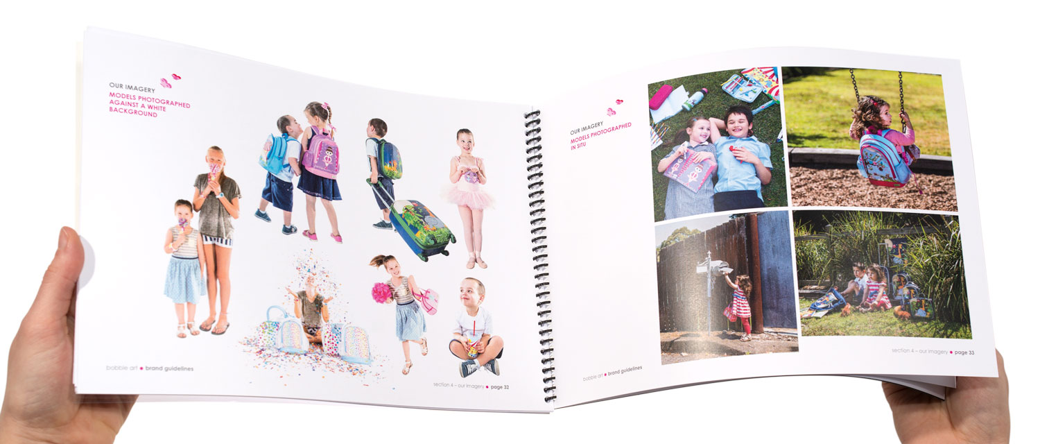
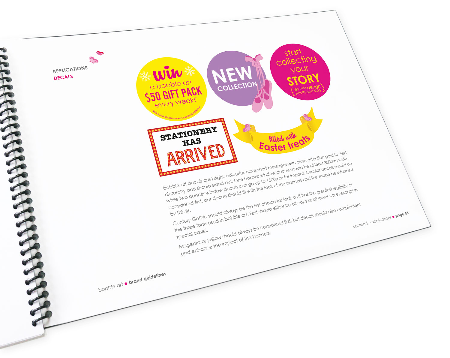
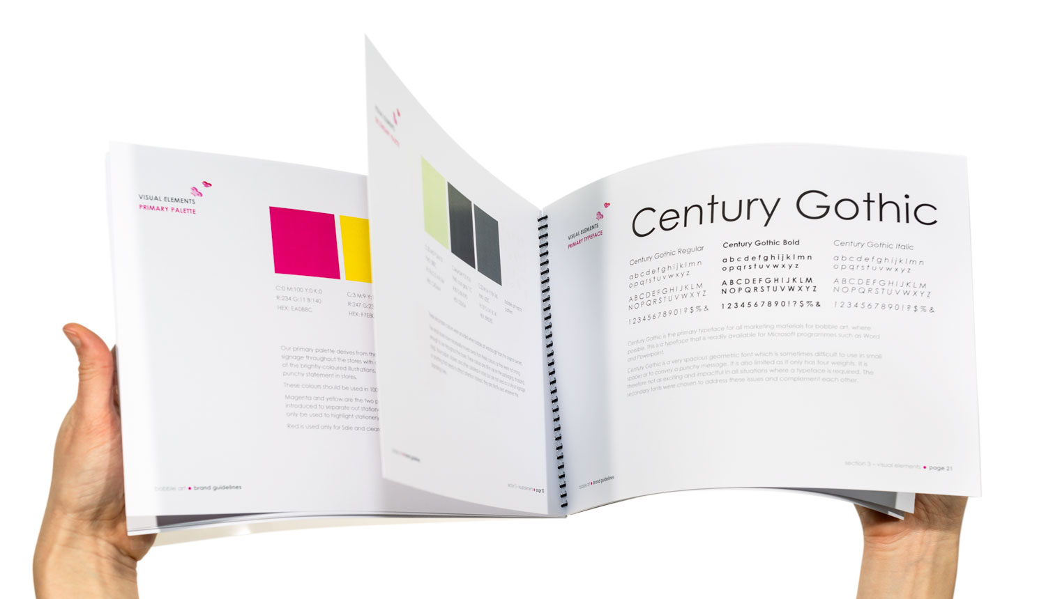
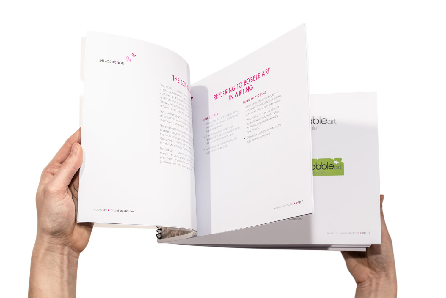
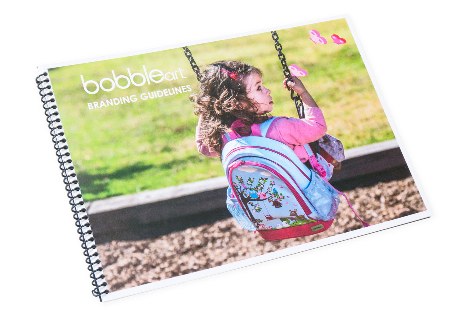
To make my busy work life easier and keep the branding consistent, I developed a branding manual. In it, I cover all the aspects of the brand that I developed, from logo usage standards to fonts, colours, imagery, photographic briefs and usage examples. This could be passed on to the next designer when I left for London in 2015.